To help myself get some inspiration for the logo and typographic design behind my film logo, I decided to look up some design trends of this year. This is often my first port of call because it often helps set various ideas in my head, which I can then explore further. Below are my favourite trends of this year.
I've always been a massive fan of anaglyphs, maybe because of the 3D nature of them or the contrasting colours, but mainly I think because there's the possibility of so much more depth than just with a single spot colour and the simplicity of a symbol. Despite this being a really fun logo trends, I'm not entirely sure how I would integrate it into my work for this project or if it would suit the type of design I need for this project.
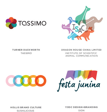
This is a bit similar to the above anaglyphs, but I think this one's got a lot more scope to play with. By overlapping so many elements, you can involve a number of different aspects to your product into the logo without necessarily over-complicating the design. Again, however much I like this type of design, I don't think that it would necessarily work for my project.
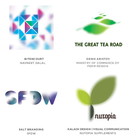
Selective focus logos are a really interesting way to define one's focal point. I'm planning to go down the typographical route for my logo design, but this design trend has definitely inspired me to experiment with focussing within my design process.
This is a really interesting trend that's popped up this year. Not happy with just the one logo, designing many to adapt to different occasions and needs is really interesting. Again, may not entirely work with what I'm planning for my urban exploration film logo but I think it could be something worth experimenting with. This could transfer well into poster design, or guerilla advertising for example.


No comments:
Post a Comment